Glenstone: Balancing elegance with accessibility

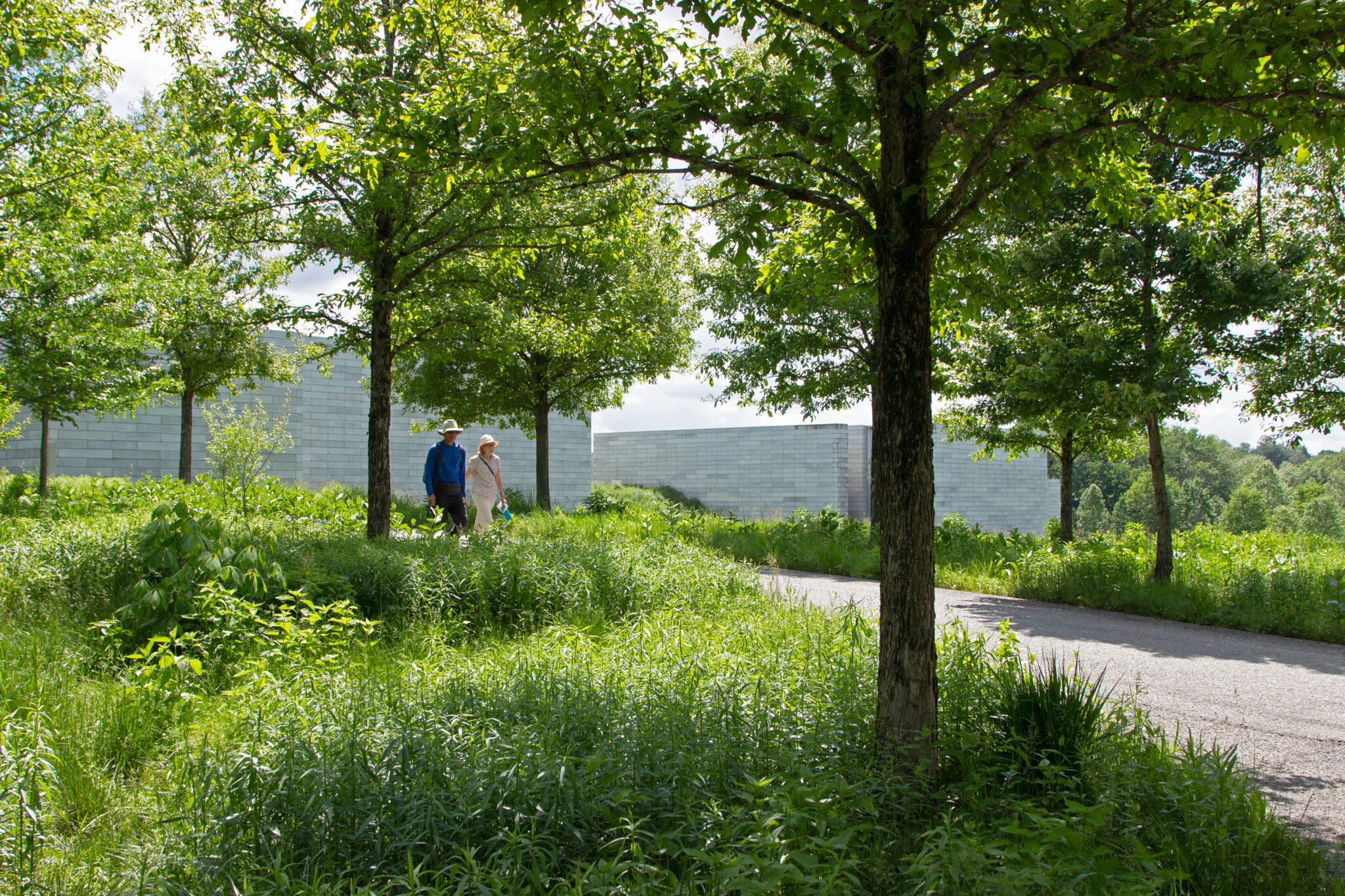
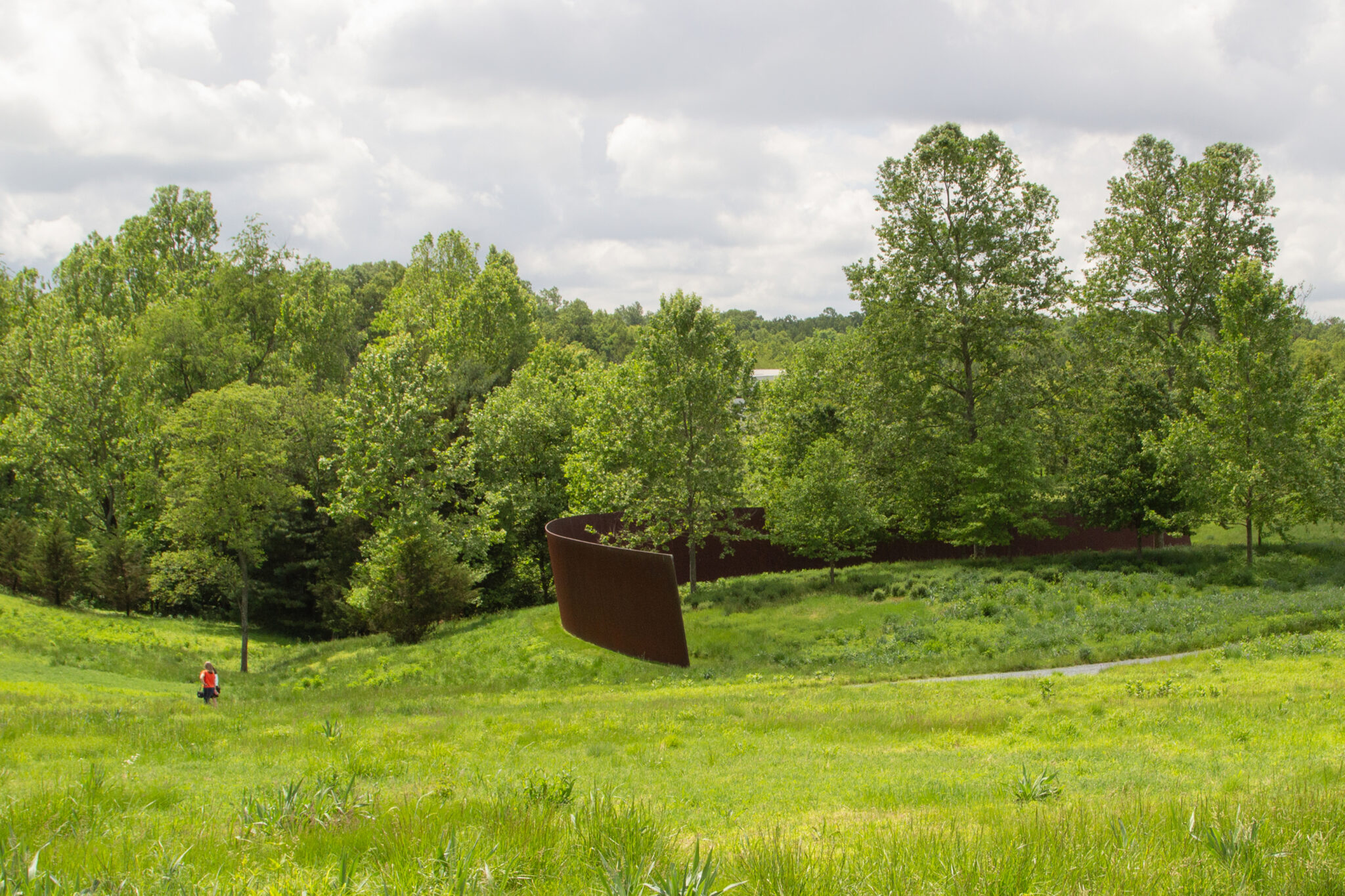
Glenstone is a museum shaped by intention—where art, architecture, and nature come together to invite stillness, reflection, and presence. Founded by Emily and Mitch Rales, the institution centers modern and contemporary art in a setting that encourages contemplation and reflection. Each element functions in quiet collaboration, creating space for meaningful encounters. After nearly two decades of growth, Glenstone partnered with ROOM FOR MAGIC to redefine an identity rooted in their core philosophy, yet expansive enough to carry them forward.
The Challenge
Glenstone found itself navigating a tension between two core values. One leaned toward minimalism—favoring sleekness, restraint, and a quiet visual language that allowed art, architecture, and nature to lead. The other called for warmth—inviting inclusivity, approachability, and greater public connection.
RFM partnered with Glenstone to evolve their brand in a way that honored both. By balancing these seemingly opposing values, we helped shape an identity that feels both elevated and welcoming—one that could be implemented with clarity and consistency across every touchpoint.
“We want to be inclusive without losing our serene, contemplative identity.”
—Glenstone Team
Research & Strategy
We approached this as both a strategic and design challenge—believing that the right insight would lead to the right outcome. Without an informed design system, Glenstone’s brand had become inconsistent and unable to keep pace with its growth. To ground our work, we conducted stakeholder interviews, reviewed internal documents, analyzed peer institutions, and examined their new website—gathering input from both visitors and staff to understand the system’s needs, gaps, and opportunities for expansion.
Design
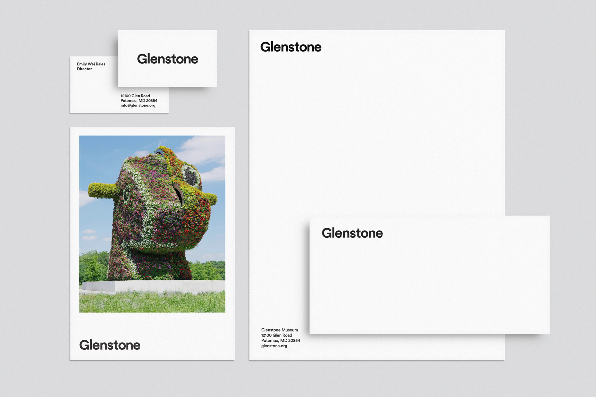
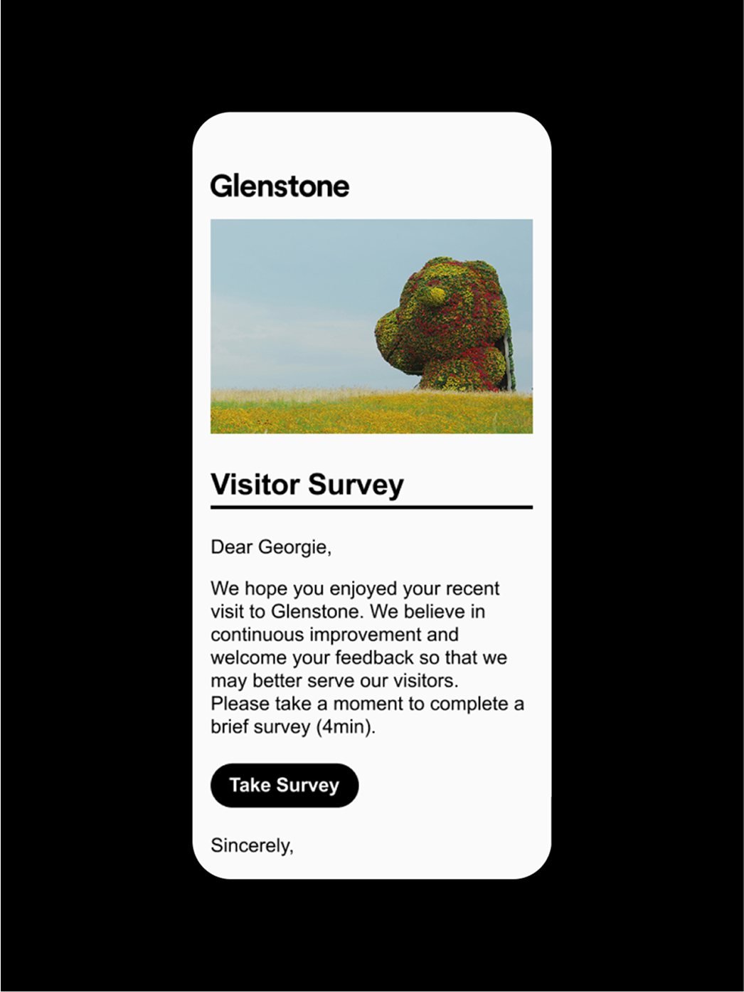
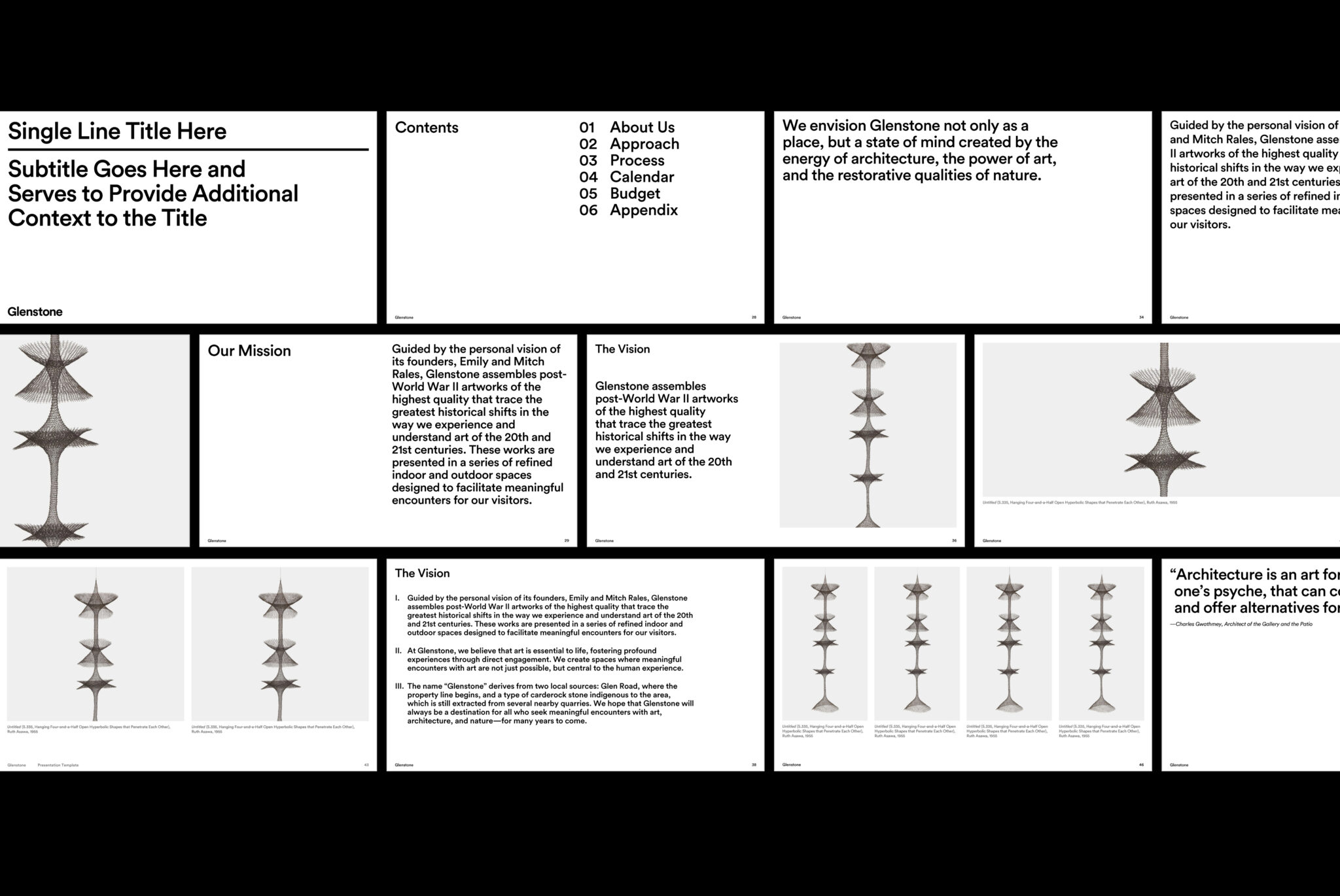
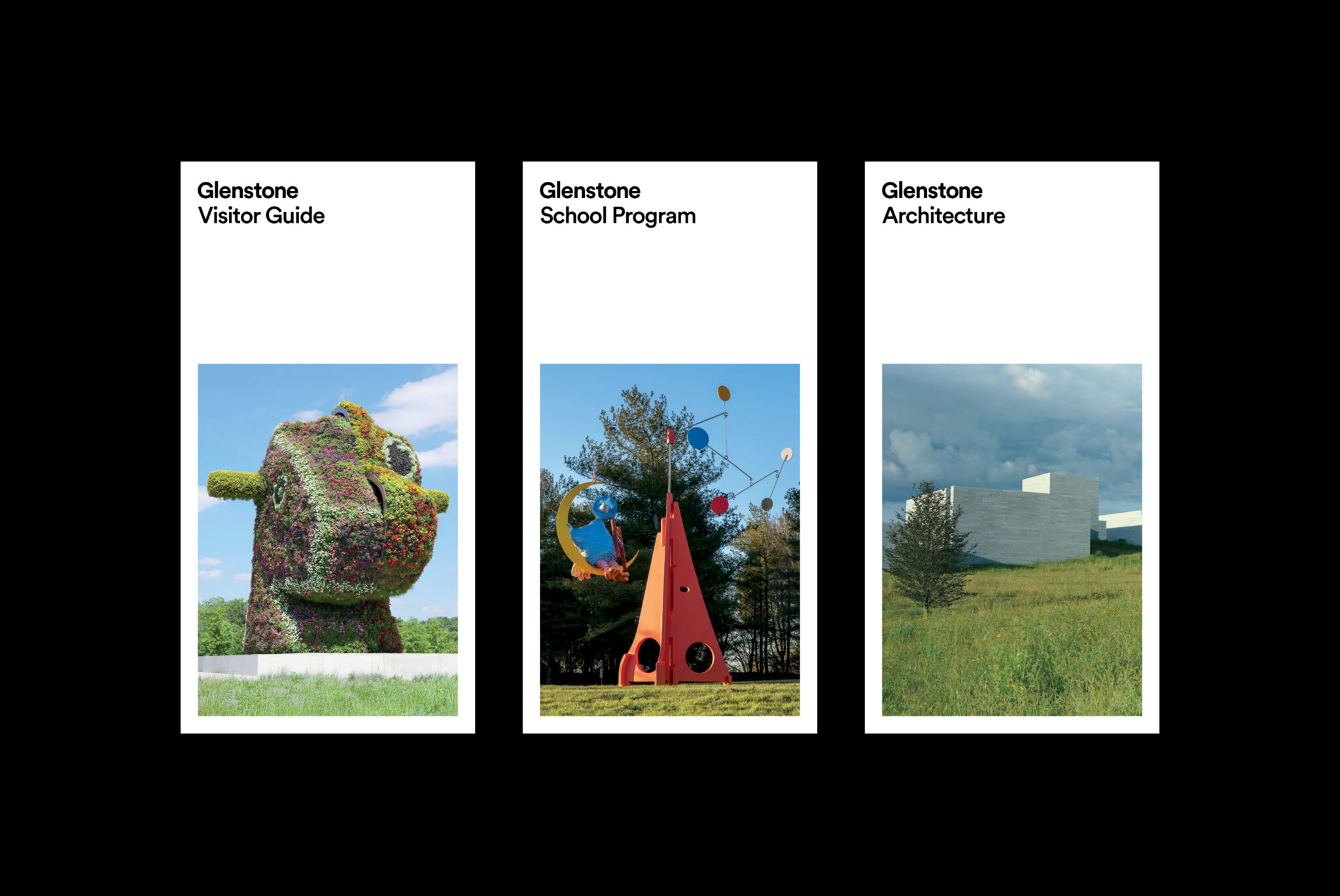
We started the design process by bridging the gap between digital and physical design, standardizing the core elements of the brand identity across all applications to provide a unified experience of the brand. Next, we focused on improving key branded assets, such as visitor brochures and the campus map, prioritizing accessibility and functionality, ensuring an intuitive user experience with design elements that meet industry standards.


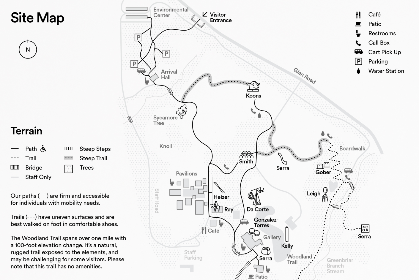
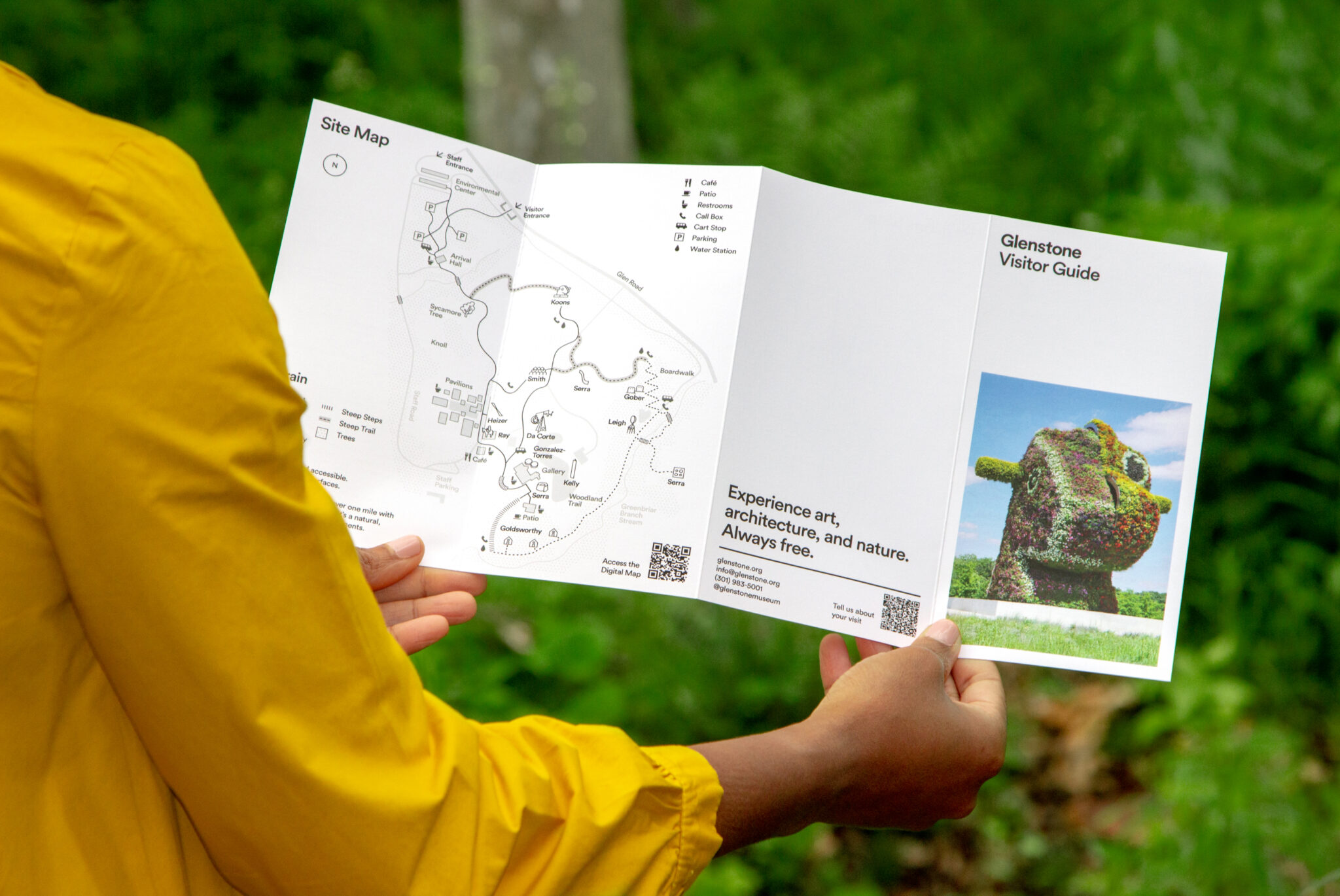
Map and Accessibility
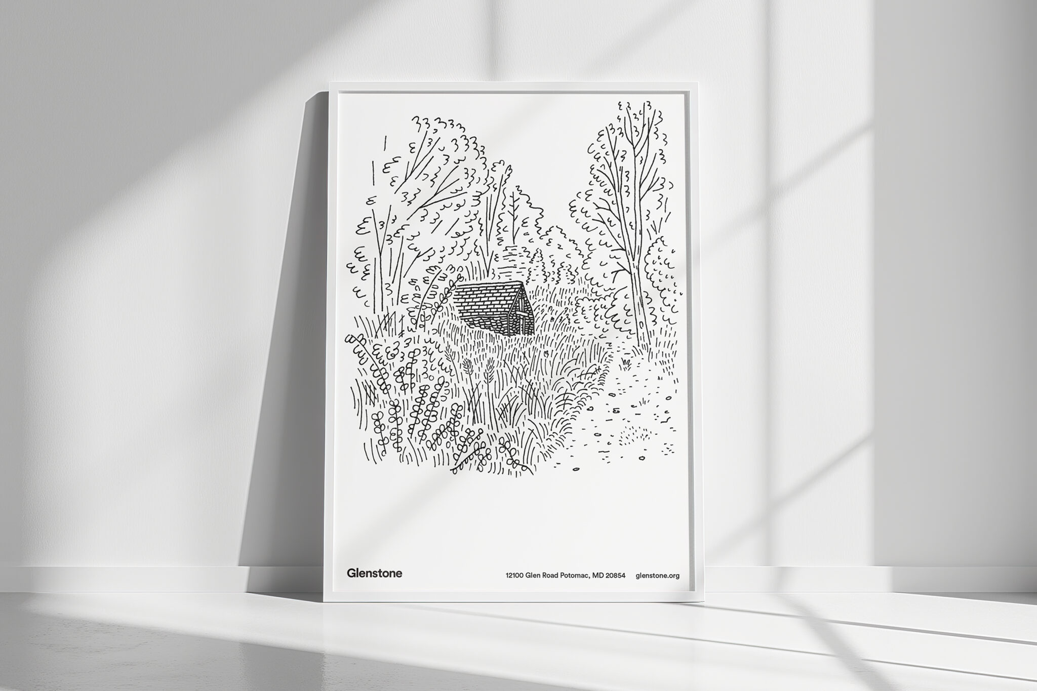
With the launch of the new website, we redesigned the print map to better align with its digital version, adding practical features like indicators for steep paths and bridges to enhance usability. In this process, we also clarified the roles of icons and illustrations within the brand: hand-drawn illustrations convey warmth for editorial use, while icons provide clarity for instructional purposes. Clear guidelines now distinguish their application to ensure consistency across materials.


Layout & Photography
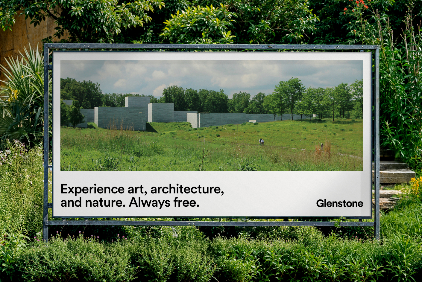
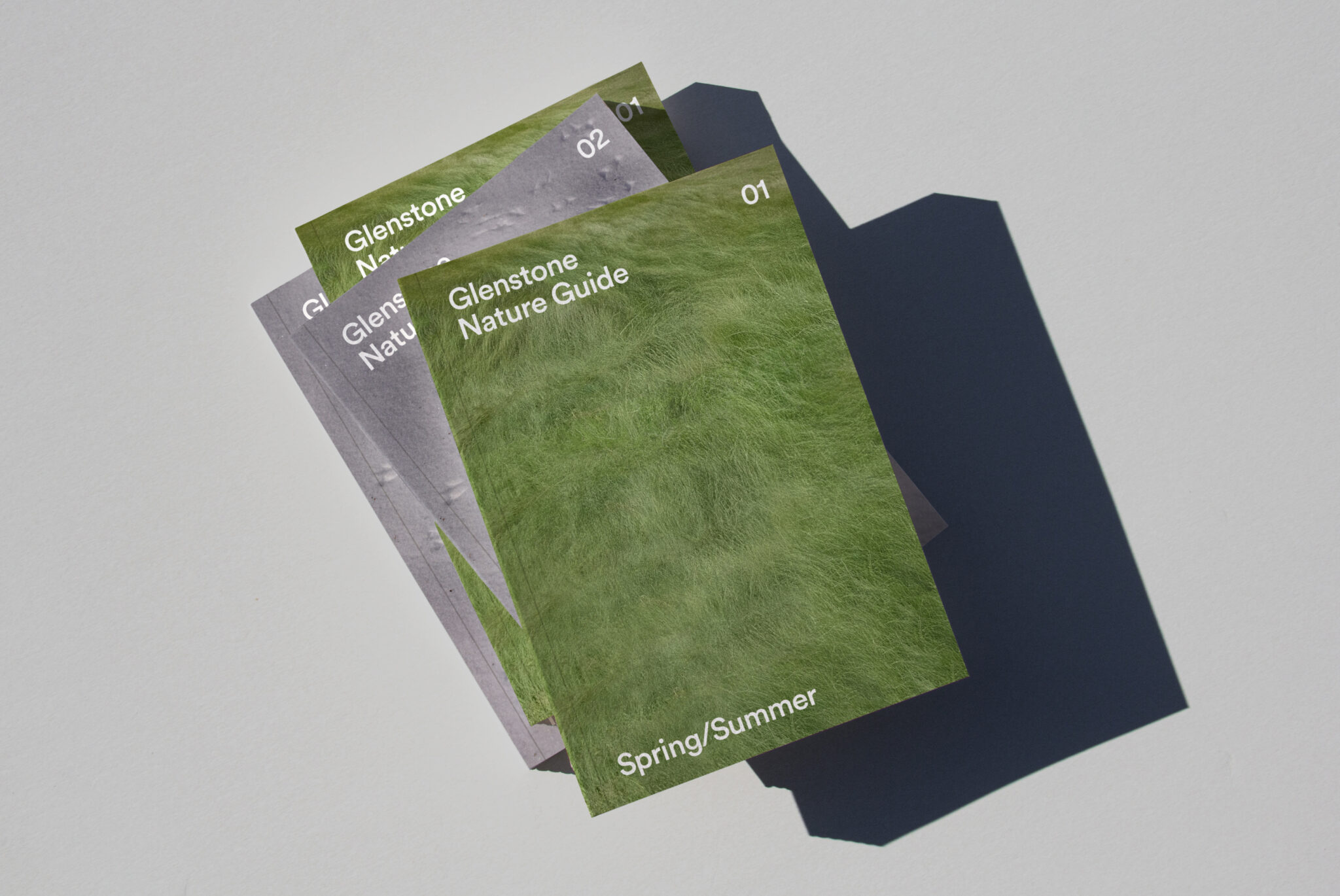
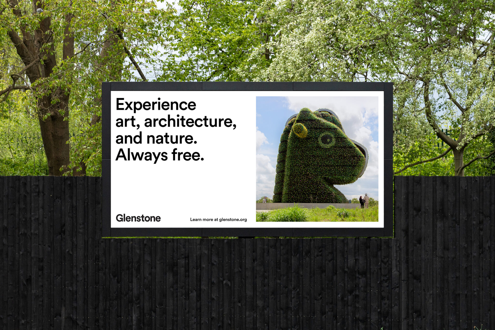
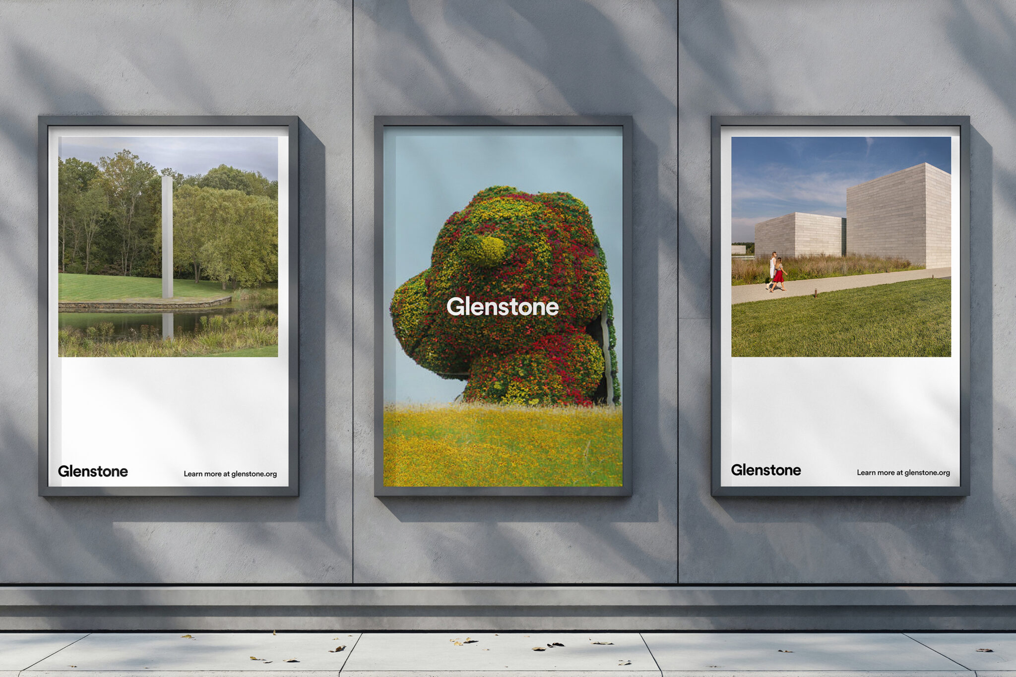
Layout and photography guidelines provide Glenstone staff with a clear framework for creating assets that carry the new brand forward. The introduction of macro-crop photography—tightly cropped, high-resolution images that emphasize colors, materials, and natural details unique to Glenstone—subtly evokes the experience of being on-site. In contrast, showing uncropped images within a frame creates meaningful negative space, a signature element across branded materials.

“ROOM FOR MAGIC was an incredible partner to us. They did their research and listened deeply to our team, ensuring they understood our culture and brand values before moving into visual design. The result was an expanded brand system with lasting impact that can take us into the future.”
—Glenstone Team
Building Systems that Scale
We expanded Glenstone’s brand guidelines with new elements, including a secondary color palette and updated rules for illustration and photography, ensuring a cohesive identity across diverse touchpoints. To support implementation, we developed a toolkit with digital and print templates, enabling staff to create branded materials with confidence and consistency.